Sanna Anukka is a designer born and based in Brighton, UK currently working as a printmaker and textile designer, inspired by her finnish heritage she spends her time designing for the collections at Marmimekko while also working on her own range of silk screen prints and other products, after graduating in 2005 she started of as a freelancer selling the screen prints she had printed in her final year at her sister-in-law's Scandinavian design boutique in London, she was spotted by the CEO of marimekko in British Vouge, who regularly invited her to their headquarters.
Friday, 17 October 2014
Marimekko
Sanna Anukka is a designer born and based in Brighton, UK currently working as a printmaker and textile designer, inspired by her finnish heritage she spends her time designing for the collections at Marmimekko while also working on her own range of silk screen prints and other products, after graduating in 2005 she started of as a freelancer selling the screen prints she had printed in her final year at her sister-in-law's Scandinavian design boutique in London, she was spotted by the CEO of marimekko in British Vouge, who regularly invited her to their headquarters.
Friday, 5 September 2014
Alekander Rochenko
Aleksander Mikhailovich Rodchenko was born on the 5th of December 1891 in St. Petersburg,Russia, he was a, sculptor, photographer and graphic designer and was one of the main components into the foundation of constuctivism and Russian design, due to him being highly influenced by the pre-Revolutionary work of Kazimir Malevich, a Russian painter and Art theorist and Vladimir Tatlin, a Russian and Soviet Architect and Painter,Rodchenko's work is also heavly influenced by Cubism and Futurism, he is seen as one of the most diverse Constructivist and Productivist artists to emerge after the Russian Revolution.

He was born into a working class family in St.Petersburg, although moved to Kazan in 1909 after the death of his father, it was at this time Rodchenko decided he wanted to study art, although not having much exposure to the art world, except from art magazines.
In 1910 he entered the Kazan School of Fine Arts where he was taught by Nikolai Feshin, a painter and Georgii Medvedev, which he graduated from in 1914 and also met his future wife Varvara Stepanova.
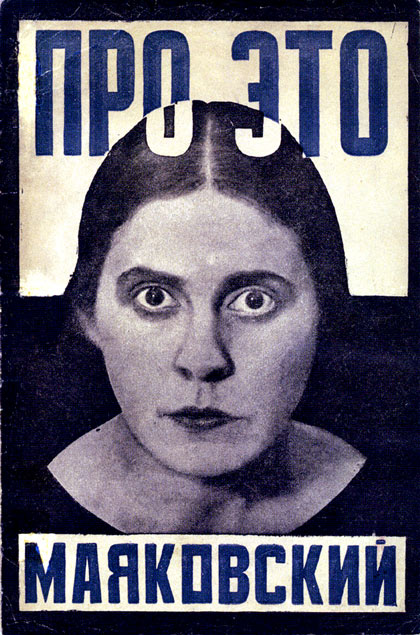
After graduating he went to lectures by several Russian Futurist, one of them happening to to be Vladimir Mayakovsky, he became a supporter of Futurism.
After 1914 Rodchenko continued with an artistic education at Stroganov Institute in Moscow, where he had enrolled in Graphics, this was the school at which he created his first abstract drawings, influenced by the Suprematism of Kazimir Malevich in 1915 and the next year he took part in an exhibition "The Store" organised by Vladimir Tatlin.
Rodchenko had his own exhibition between 1917 and 1921 called, ' Exhibition of works by Rodchenko (1910-17) where he made his first collages using found photography, at this time he had left behind his Futurist style for a entirely abstract and geometric look.
 Rodchenko had given up painting allowing him to concentrate on graphic design for posters, books, and films. In 1922 he had worked with Dziga Vertov, a filmaker who deepely influenced Rodchenko.
In the early 1920's Rodchenko thought to take up different types of art, abdoning his painting to concentrate on the other forms of art, drawn by the photomontages by German Dadaist he started his own experiments, using found images in 1923 but from 1924 onwards he also used his own images, gaining countless commissions for book covers and postersand was one of the first to experiment with photomontages, the first one he published was for Mayakovsky's poem "About this" which illustrated the front cover in 1923, however he did use other forms of art such as furniture, poster, book and typographic design as he believed that these art forms were more effect to communicating the messages of the soviet union, up until 1928 Rodchenko and Mayakovsky worked very closely with one another on the design and layout of LEF and Novy LEF, also becoming principal designer which was the publications of Constructivist artists with many of Rodchenko's photographs featured or used as the cover.
During the 1920's Rodchenko's work majorly reflected what was happening in the communist regime during that time, that same year he had become a huge leader in the Constructivist movement, playing a large part in making constructivism what it is today and making Rodchenko who he was, he established the first working group of constructivist who also regarded themselves as more important and practical to society all together.

In 1928 he joined the october circle of artist but was removed from the group in 1931 due to being charged with 'Formalism' and after that returned to painting, he stopped his photography in 1942 and was producing abstract expressionist art, although he was still organising photography exhibitions for the goverment and he was able to gain commissions for photography and advertising for the rest of his life and achieved being part of more than 50 exhibitions before he died in Moscow in 1956.

He was born into a working class family in St.Petersburg, although moved to Kazan in 1909 after the death of his father, it was at this time Rodchenko decided he wanted to study art, although not having much exposure to the art world, except from art magazines.
In 1910 he entered the Kazan School of Fine Arts where he was taught by Nikolai Feshin, a painter and Georgii Medvedev, which he graduated from in 1914 and also met his future wife Varvara Stepanova.
After graduating he went to lectures by several Russian Futurist, one of them happening to to be Vladimir Mayakovsky, he became a supporter of Futurism.
After 1914 Rodchenko continued with an artistic education at Stroganov Institute in Moscow, where he had enrolled in Graphics, this was the school at which he created his first abstract drawings, influenced by the Suprematism of Kazimir Malevich in 1915 and the next year he took part in an exhibition "The Store" organised by Vladimir Tatlin.
Rodchenko had his own exhibition between 1917 and 1921 called, ' Exhibition of works by Rodchenko (1910-17) where he made his first collages using found photography, at this time he had left behind his Futurist style for a entirely abstract and geometric look.

In the early 1920's Rodchenko thought to take up different types of art, abdoning his painting to concentrate on the other forms of art, drawn by the photomontages by German Dadaist he started his own experiments, using found images in 1923 but from 1924 onwards he also used his own images, gaining countless commissions for book covers and postersand was one of the first to experiment with photomontages, the first one he published was for Mayakovsky's poem "About this" which illustrated the front cover in 1923, however he did use other forms of art such as furniture, poster, book and typographic design as he believed that these art forms were more effect to communicating the messages of the soviet union, up until 1928 Rodchenko and Mayakovsky worked very closely with one another on the design and layout of LEF and Novy LEF, also becoming principal designer which was the publications of Constructivist artists with many of Rodchenko's photographs featured or used as the cover.
During the 1920's Rodchenko's work majorly reflected what was happening in the communist regime during that time, that same year he had become a huge leader in the Constructivist movement, playing a large part in making constructivism what it is today and making Rodchenko who he was, he established the first working group of constructivist who also regarded themselves as more important and practical to society all together.
In 1928 he joined the october circle of artist but was removed from the group in 1931 due to being charged with 'Formalism' and after that returned to painting, he stopped his photography in 1942 and was producing abstract expressionist art, although he was still organising photography exhibitions for the goverment and he was able to gain commissions for photography and advertising for the rest of his life and achieved being part of more than 50 exhibitions before he died in Moscow in 1956.
Tuesday, 2 September 2014
Kurt Schwitters analysis

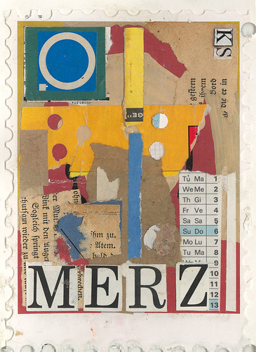
Kurt Hermann Eduard Karl Julius Schwitters was born in Hanover, Germany, on the 20th of June 1887, he was a painter, sculptor and designer working in genres such as Dada, Constructism, Surrealism, Graphic design and typography, however he is most famous for his collages, which he named him self Merz.
He was the only child of Edward and Henriette Schwitters, they were a wealthy family however as a child Kurt was described as being a 'loner'
The family moved to Waldstrasse in 1901 which would also be the future site of the Merzbau, that same year he suffered his first epileptic seizure, a condition that would hold him back from serving in world war I, between 1908 and 1909 he studied at the Kunstgewerbeschule (school of arts and crafts) in Hanover, where he had his first exhibition in 1911, he later studied at the "Kunstakademie" in Dresden until 1915, along-side contemporary artist Otto Dix and George Grosz, however he appears to have not known of their work, Schwitters long academic education being a student of Carl Bantzer, who was greatly inspired by Frans Hals had seemed to prepare Schwitters for a conventional painters career, and his early works seem to show very little influence by the modern age, After studying in Dresden Schwitters returned to Hanover and was able to start his art career as a post impressionist
On October the 5th, 1915 Schwitters married his cousin Helma Fischer, the following September they had their first son Gerd, who died within a week of birth, they had their second son Ernst on the 16th of November 1918, he was very close to his father for his whole life.
For the final year and a half of the war he was working as a technical draftsman in a factory near Hanover, In 1917 he was moved into the 73rd Hanoverian Regiment, however 3 months later he was excused from service as he was seen as unfit, due to his experience as a draftsman he had said himself that it had influenced his later work, 'using the machines as metaphors of human activity', he had quoted "In the war I discovered my love for the wheel and recognized that machines are abstractions of the human spirit", although in as the first world war progressed his work had seemed to become darker, slowly developing an expressionist tone, due to Germany's economic, political and military collapse in 1918, Schwitters art made a dramatic change as a result of this, he had said "In the war, things were in terrible turmoil. What I had learned at the academy was of no use to me and theuseful new ideas were still unready, Everything had broken down and new things had to be made out of the fragments; and this is Merz. It was like a revolution within me, not as it was, but as it should have been."
He came into contact with the Dada Movement in the autumn of 1918 in Berlin, where the first of his abstract collages began to appear which were notably influenced by the work of Hans Arp, this is where Schwitters began to call his collages 'Merzbilder', however he was rejected from joining the Dada movement in late 1918/early 1919 due to his associations with Der Strum and Expressionism.
In the August of 1919 Schwitters published a mock-romantic poem 'An Anna Blume', it was very successful in Germany and from this point onwards he called his one-man movement 'Merz' which comes from the word 'Kommerz' which had a number of meanings for Schwitters, the most frequently used ones 'Refuse' or 'Rejects', hence the use of found materials on streets or in parks.
As an entrepreneur he traveled across Europe, earning himself a reputation as a amazing business man
In 1924 Kurt set up his own advertising and design agency in Hannover, theMerz-Werbezentrale. Some of his accounts being Wagner, makers of Pelikan inks and of Bahlsen biscuits. He showed new forms of typography and “was the guiding light of an association of modernist advertising agents”. In 1927, him and friedrich Vordemberge-gildewart forming a group known as ‘die abstrakten hannover’ (The abstract Hanover)
 One of Schwitters largest pieces of work was in fact his studio in his family home, which he called the merzabau, he began to working on it in 1923 and gradually over time it grew into an ever changing abstract walk in collage which was made out of grottoes, columns, found objects, and sculptures so instead of just being a studio it was more like a work of art, however the merzabau was left unfinished when Schwitters left Germany to escape the threat of Nazi Germany in December 1936, but in 1943 while Schwitters was still away in Norway the Merzabau was destroyed in a bombing raid, although there are photographs which were taken by Wihelm Redemann in 1933 but the photographs only show what the Merzabau would have looked like at that particular point in time as it was not a static piece of art.
whilst he was not allowed in Germany Schwitters began to work on a second Merzbau in 1937 in Lysaker near Oslo, but soon after the Nazis invaded and he abandoned it and yet again the Merzbau was destroyed, this time by a fire in 1951.
He arrived in Isle of Man at Hutchinson Camp on July 17th 1940 and was quickly equipt with studio space where he began to take on students, many of them would go on to become significant artists, the camp was known as the "artist camp" consisting of many artists, writers, university professors and other intellectuals
Schwitters granted his freedom on 21 November 1941, he moved to London where he meet many artists such as Naum Gabo, László Moholy-Nagy and Ben Nicholson. He had his first solo exhibition in December 1944 however it did not go very well as only one out of forty of his works were bought.
He was left temporarily paralyzed on one side of his body after suffering from his first stroke in 1944, he finally came to the decision to recreate the Merzbau in 1947 at a barn at Cylinders Farm in Elterwater, he soon found out that Museum of Modern Art in new York had awarded him £1000 so that he would be able to repair or recreate his Merzbau's in Germany and Norway, but he used these funds to create the 'Merzbarn' which he worked on daily.
A day before his death on January the 7th 1948 he finally received his British citizenship, but died the next day from pulmonary edema and myocarditis.
Thursday, 31 July 2014
Jules Cheret Analysis
Jules Chéret Born May 31,1836 in Paris to a poor but creative family of artisans was a French painter and lithographer who became a master of Belle Époqueposter art, French for Beautiful Era.
 At age 13 he began a three year apprenticeship with a lithographer where his interest then led him to take an art course at the Ecole and Nationale de Dessin, This Poster was the first Poster made for the Moulin Rouge, called "La Goulue" (1891), His work is part of the art nouveau movent as it has similarities to other pieces of work from that time period, however Jules Cheret seemed to make it more of his own and add his own touch, I chose to analyse this particular piece of his work as it was his first poster made, which gained him a lot of recognition for his other posters, From 1859 to 1866 he was trained in Lithography in London where he was highly influenced by the British approach to poster design and printing, his other main influences was Rococo which developed in the early 18th century in Paris, as a reaction against the grandeur, symmetry, and strict regulations of the Baroque, especially of the Palace of Versailles such as Jean- Honore Frangonard and Antoine Watteau.
(work by Jean-Honore Frangonard)

He created posters in many categories such as Operas, Ballets, Pantomimes, Balls and Dance Halls, Newspapers and Magazines and Novels
As his work became more familiar to people and his posters showing free-spirited females were able to attract a broader audience, pundits began calling him the "father of the women's liberation." Females had previously been portrayed ass prostitutes in art, However the women shown in his posters where usually referred to as 'Cherrettes' which where the complete opposite to prostitutes, It was a relief for the women living in Paris at the time, and introduced a evidently more open atmosphere where women were able to take part activities that would have been seen as 'Taboo' before, for example, wearing low cut clothing and smoking in public.
(Georges de Feure)
 In 1895 he came up with the
Maîtres de l'Affiche which was a collection of original works from ninety seven artist who were born or raised in Paris, but in a smaller 11 x 15 inch format, his success inspired many and started of a new generation of poster designers and painters such as Henri de Toulouse-Lautrec who was was a French painter, print-maker, draughtsman and illustrator, one of his students was Georges de Feure who was a theatrical poster designer, and by looking at his work you can clearly see his was inspired by Jules Cheret, as the women drawn in both the posters both have an art nouveau look about them.
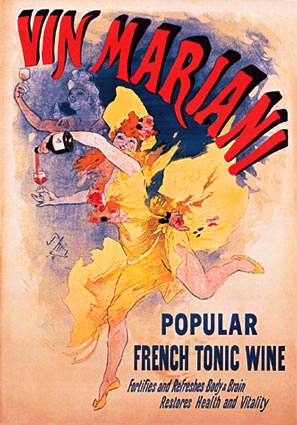
Personally I like the simplicity seen in some of Jules Cherets work, for example in many of his posters he uses mainly primary colours such as reds and blues and yellow, I feel this is effective because it makes the main subject stand out, which is the woman and would have given people an idea about what the poster is for even if they were just walking past, also I noticed in this particular poster Cheret only coloured the section behind the woman, leaving the rest of the page almost neutral, therefore making the typography stand out even more, I also like the delicacy of the painting of them women dancing as it can been as trying to show how free and fun these women in the posters are.
Saul Bass
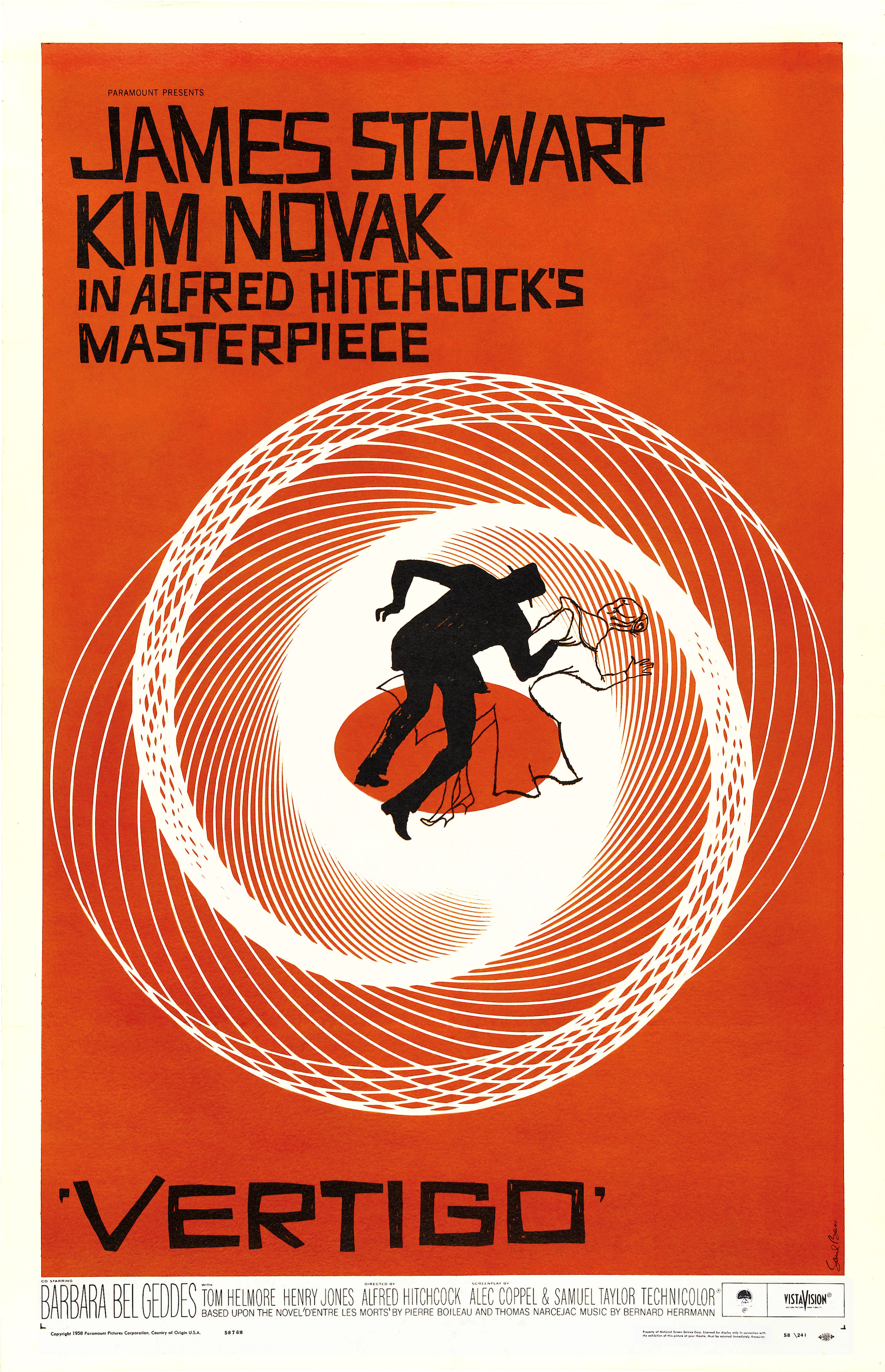
Saul Bass (May 8th, 1920- April 25th, 1996) was born in the bronx, New york to Eastern European Jewish immigrant parents, and was said to have been very creative as a child and drew constantly, he went to James Monroe High school in the bronx where he also graduated, before being awarded a scholarship in 1936 to study part time in Manhattan at the Art Students League, but then began taking night classes at Brooklyn college with Gyorgy Kepes who was a painter, designer and art theorist and introduced Saul to Moholy's Bauhaus style and to Russian Constructivism, which may have influenced his later work with title sequences and posters as there is great use of lines and geometric shapes, also his use of composition he does not arrange everything neatly in his work, they usually have a jagged or angled look.
Bass is an American Graphic designer and award winning film maker and is mostly known for his film posters, title sequences and corporate logos, during his career he has worked with some of hollywoods important film makers such as Alfred Hitchcock, Otto Preminger and Billy Wilder, One of his most famous title sequences is the animated is for 'The man with the golden arm' where the whole sequence is an animated paper cut out of a heroin addicts arm.
He also designed some of the biggest corporate logos in America such as, the Bell system logo (1969), AT&T's globe logo (1983), and Continental Airlines and United Airlines with both become some of the most known airline logos of that era.
Before 'The Man with the Golden Arm' was released, projectionists at cinemas would usually not open the curtains to show the screen until after the title sequence had finished due to them being so dull, however when 'The Man with the Golden Arm' arrivied at movie theaters in 1955 there was a note on the cans telling the projectionist to keep the curtains open during the titles as the director and producer, Otto Preminger wanted the audience to see the titles as a necessary part of the film.

He had once said his main goal for his title sequences was to "try to reach for a simple, visual phrase that tells you what the picture is all about and evokes the essence of the story"
 He designed title sequences for over 40 years and created a variety of film making techniques, from cut out animation to fully animated mini films and live action sequences, which usually were used as prologues to the films as they easily transitioned into the first scene, for example in the film 'The Victors' the opening sequence is used to show the 27 years between World War I and the middle of World War II, where the film begins.
Accompanied by his second wife Elaine he created other amazing title squences for other directors,in 1968 he then directed a series of shots in an Oscar-winning short documentary film, 'Why Man Creates' where he finally realised his desire to direct a feature, in which he went on to direct a feature length American Sci-fi film called Phase IV in 1974.
Nearing to the end of his career he created title sequences for Martin Scorsese who had grown up respecting his film work, while collaborating also with his wife they created the title sequences for the films Goodfellas, Cape Fear, The Age of Innocence and Casino, his late work with Scorsese abled him to explore with the use of computerized effects instead his original optical techniques.
Bass is an American Graphic designer and award winning film maker and is mostly known for his film posters, title sequences and corporate logos, during his career he has worked with some of hollywoods important film makers such as Alfred Hitchcock, Otto Preminger and Billy Wilder, One of his most famous title sequences is the animated is for 'The man with the golden arm' where the whole sequence is an animated paper cut out of a heroin addicts arm.
He also designed some of the biggest corporate logos in America such as, the Bell system logo (1969), AT&T's globe logo (1983), and Continental Airlines and United Airlines with both become some of the most known airline logos of that era.
Before 'The Man with the Golden Arm' was released, projectionists at cinemas would usually not open the curtains to show the screen until after the title sequence had finished due to them being so dull, however when 'The Man with the Golden Arm' arrivied at movie theaters in 1955 there was a note on the cans telling the projectionist to keep the curtains open during the titles as the director and producer, Otto Preminger wanted the audience to see the titles as a necessary part of the film.
His time in Hollywood took off in the 1940's where he was designing print advertisements for films such as, Champion, Death of a salesman and The Moon is blue, however in 1954 he made his first collaboration with Otto Preminger whilst designing a film poster for 'Carmen Jones', Preminger was so happy with the outcome he asked Bass to produce the title sequence as well, this was when he realised he could create a title sequence that could be entertaining for an audience and contribute to the mood and the theme of the movie within the opening moments, he was one of the first to realise the creative potential of the opening and closing credits of a film, although it was in 1955 after the realease of 'The Man with the Golden arm' that Saul Bass became widely known in the film industry.
He work as a freelance graphic designer/commericial artist after apprenticeships with Manhattan design firms, he moved to from New York to Los Angeles in 1946, and by 1950 had opened his own studio, mainly concerntrating on advertising until Preminger asked him to design the poster for his film, Carmen jones
He work as a freelance graphic designer/commericial artist after apprenticeships with Manhattan design firms, he moved to from New York to Los Angeles in 1946, and by 1950 had opened his own studio, mainly concerntrating on advertising until Preminger asked him to design the poster for his film, Carmen jones
Bass also created a new type of moving typography for the title sequence for the film 'North By Northwest, Vertigo and Psycho, before his title sequences in the 1950's title sequences were usually very still and there was usually no link between the sequence and the film, but Saul was able to change this, it was this kind of work that made him a respected as a graphic designer.
Accompanied by his second wife Elaine he created other amazing title squences for other directors,in 1968 he then directed a series of shots in an Oscar-winning short documentary film, 'Why Man Creates' where he finally realised his desire to direct a feature, in which he went on to direct a feature length American Sci-fi film called Phase IV in 1974.
Nearing to the end of his career he created title sequences for Martin Scorsese who had grown up respecting his film work, while collaborating also with his wife they created the title sequences for the films Goodfellas, Cape Fear, The Age of Innocence and Casino, his late work with Scorsese abled him to explore with the use of computerized effects instead his original optical techniques.
April Greiman Analysis
April Greiman is a Designer born in metropolitan New York City in 1948, and is widely recognized as one of the first designers to use computer technology as a design tool.
She currently teaches at Woodbury University, and has received four Honorary doctorates and also the American Institute of Graphics Arts Gold Medal.
Her design education began when she decided to apply for an Art school, Rhode Island School of Design however she failed in part of the application where she had to draw a pair of old boots, however it was pointed out that her portfolio was very strong in Graphics and they suggested she applied for a Graphics Design course which led her to apply at Kansas City Arty Institute, where she began to study Graphic design between 1966 and 1970, there she was introduced to the principles of Modernism by Inge Druckrey, Hans Alleman and Chris Zelinsky who had all studied at the Basel School of Design, which pushed Greiman to make the decisions to move to Switzerland to study at the allgemeine Kunstgewerberschule basel 1970 to 1971, she was a student of Wolfgang Weingart and Armin Hoffman, who are both well known Graphic Designers she was highly influenced by the International style as she explored it in great depth, the International style is a major architectural style said to have emerged in the 1920's & 30's.
She moved to Los Angeles in 1976, in the 70's many contemporary designers believed that digitalisation and computers would endanger the International style, yet Greiman did not agree with this belief and made sure made use of and other digitalisation "errors" as essential parts of her digital art.

In 1982 she became head of the design apartment at the California institute of the Arts, whilst there she devoted her time to exploring design education as she had access to state of the art video and digitizing equipment, using video and analogue computer to combine different elements through the new media, she knew that the new and upcoming technologies in graphic design would soon be put into every day design practice.
In 1986 Greiman was invited to design and showcase her own work in issue #133 of design quarterly, entitled 'Does it make sense?", instead of the standard thirty two page sequence she reformatted the magazine as a poster that folded out to almost three by six feet which showed a life size image of her digitized naked body against a background of symbolic images and text
In 1995 Greiman designed a postal stamp to celebrate the Nineteenth Amendment to the United states constitution for women's voting rights, which was used by the U.S Postal service, in 2006 her digital photography work 'Drive-by Shooting', was exhibited at Pasadena Museum of California Art, it a project she had began over 26 years before it was shown, using a 5mm Nikon, then a Polaroid SX-70
 "Hand Holding a Bowl of Rice" was the biggest piece of work she had created in 2007 which was a public mural spreading over seven stories on two builds which marked the entrance to the Whilshire Vermont Metro station in Los Angeles.
She currently teaches at Woodbury University, and has received four Honorary doctorates and also the American Institute of Graphics Arts Gold Medal.
Her design education began when she decided to apply for an Art school, Rhode Island School of Design however she failed in part of the application where she had to draw a pair of old boots, however it was pointed out that her portfolio was very strong in Graphics and they suggested she applied for a Graphics Design course which led her to apply at Kansas City Arty Institute, where she began to study Graphic design between 1966 and 1970, there she was introduced to the principles of Modernism by Inge Druckrey, Hans Alleman and Chris Zelinsky who had all studied at the Basel School of Design, which pushed Greiman to make the decisions to move to Switzerland to study at the allgemeine Kunstgewerberschule basel 1970 to 1971, she was a student of Wolfgang Weingart and Armin Hoffman, who are both well known Graphic Designers she was highly influenced by the International style as she explored it in great depth, the International style is a major architectural style said to have emerged in the 1920's & 30's.
She moved to Los Angeles in 1976, in the 70's many contemporary designers believed that digitalisation and computers would endanger the International style, yet Greiman did not agree with this belief and made sure made use of and other digitalisation "errors" as essential parts of her digital art.

In 1982 she became head of the design apartment at the California institute of the Arts, whilst there she devoted her time to exploring design education as she had access to state of the art video and digitizing equipment, using video and analogue computer to combine different elements through the new media, she knew that the new and upcoming technologies in graphic design would soon be put into every day design practice.
In 1986 Greiman was invited to design and showcase her own work in issue #133 of design quarterly, entitled 'Does it make sense?", instead of the standard thirty two page sequence she reformatted the magazine as a poster that folded out to almost three by six feet which showed a life size image of her digitized naked body against a background of symbolic images and text
In 1995 Greiman designed a postal stamp to celebrate the Nineteenth Amendment to the United states constitution for women's voting rights, which was used by the U.S Postal service, in 2006 her digital photography work 'Drive-by Shooting', was exhibited at Pasadena Museum of California Art, it a project she had began over 26 years before it was shown, using a 5mm Nikon, then a Polaroid SX-70

Thursday, 26 June 2014
Neville Brody
 Neville Brody was Born in Southgate,London on April the 23rd in 1957 and is a Graphic designer, typographer and art director, in his early life he studied A-level art at Minchenden Grammar school, and is a former student of Hornsey College of Art where he did a Fine Art foundation course, and Then in 1976 he attended London college of printing where he started a three-year B.A course in graphics, where his tutors usually branded his work as 'uncommercial', he is known for designing record covers for artists such as Caberet Voltaire and Depeche Mode, as well as working on 'the face' magazine and 'Arena' magazine Brody made his name largely popular through his revolutionary work as Art Director for The Facemagazine when it was first published in 1980, Other international magazine and newspaper directions have included City Limits, Lei, Per Lui, Actuel, aswell as creating a new look for two leading British newspapers The Guardian and The Observer
 He is head of the communication Art and Design department at the Royal College of Art
Punk rock was said to have had a great influence upon Brody's work around 1977, at one point he was almost thrown out of college for putting the queens head sideways on a design for a postage stamp, However this was not Brody's only motivation as his First Year thesis had been based around a comparison between dadaism and pop art.
Since the creation of his company 'Research studios' in 1994 it has expanded internationally, having offices in Paris, Berlin, Barcelona and New York, the studio focuses on branding, packaging, redesign and visual identity and had a variety of clients such as Sony, Bentley, Kenzo, Nike, Apple, The BBC and MTV europe.
Brody was also a founding Partner of a digital type library, FontShop and was the first font reseller in digital type history, while he has also designed a number of notable typefaces.
His most recent projects include the re-design of the BBC in 2011 and the Times in 2006 with the creation of a new font, times modern and is the first new font since Times new roman in 1932.
Looking at magazine layout work in the 1970's before Neville Brody, I came to find that the layout of even teenage magazines were quite basic and and plain and printed in black and white, for example this Magazine article from 1977 about a band, however in this day and age this would need attract readers due to the fact the writing is in blocks and it seems extremely long to read, taking in to account Neville Brody had to read these types of articles as it would have been some of the only information available about certain things, it most likely gave him the motivation to do something different with layout and make things more interesting, so it would be more exciting for the audience.

Personally I like Neville Brody's work as I think most of his work is very eye catching due to the use of bold colours and the different sizing of his typography, I also like the way in which he positions his typography and images as he places them horizontally, vertically and diagonally, and sometimes above or below each other, giving his work a feeling of movement and adds more atmosphere to the theme of his work.
Friday, 9 May 2014
Workshop review- Andy Potts
Andy Potts is a London based illustrator and motion designer originally from Kingswinford, he graduated with a BA Hons degree from Portsmouth university, and has worked at abbey road studio for 7 years as head designers, he focuses on image making, graphic design, animation and art direction This particular illustration was made in 2011 for one of his clients: New balance for the company to use for advertising in the store to show a runners experience in the city and also visual history of the company.

In this illustration and a majority of his other work Andy Potts tends to use very vibrant and energetic colors such as yellows, pinks and greens, this works well in this piece of work as the client is a trainer brand and features runners in the image therefore the illustration needs to give the message that this is a brand for people who exercise and a quite fit and energetic, so by using these bright colors it gives an electric and energized look and feel to the work and might give other people an idea of what type of products the company produces, the main technique used to create this illustration would have been done digitally on Illustrator using techniques such as collaging and by layer blending, although there are some handcrafted elements for example to get the silhouette of the people he would have had to take the photos first, as most of this illustration was done digitally I think it makes it look cleaner and more modern as there are no mistakes which may have occurred if the lines were hand drawn, it could also represent city life as thing can be very structured living in the city,The work is very well structured and planned out as its almost like a timeline of the company from right to left and shows their development of their products throughout the years.
Tuesday, 6 May 2014
Exam Prep Evaluation
Exam Prep Evaluation
For this Exam unit we were given the choice of three briefs, Illustration, typography or a packaging brief, I choose to do the typography brief whereby I required to create a wall art for 'Elements' a new cafe, my design had to include a typographic element that informed costumers of the food and drinks on offer in the cafe, I had done primary research such as going to the barbican exhibition and looking at other artists work which would have given us a first spark of inspiration before actually choosing our brief, I had also done sketches at the exhibition, later in the project I took my own photos of things relating to the elements or other natural objects aswell as researching online, also doing observational drawings from them to ensure I was developing my final outcome, making sure it was relating to the exam theme, Earth, air, fire and Water.
Some techniques I had used were making digital stencils and layer blending while working on illustrator also using vectors to create an image, I also used photoshop to make a clipping mask, after choosing my brief I went on to using handmade techniques such as paper cutting and painting, I thought by using handmade techniques it would make my work relate more to the exam theme as it looks more natural and less harsh then making something digitally, to generate my ideas I researched online and in books for other artists typography work to gain inspiration and to get a brief staring point for my design ideas, I then started to sketch out any design ideas I could think of, and tried to develop them into a better design which would both look and work better than the original design.
I think one of my best experiments were vectors as I found it the most enjoyable and also I think it produced the best outcome, I liked this experiment as this was a technique I was new to and it was easy to learn and do, however I did not use this technique when designing my final outcome, instead I used the more personal technique of hand made paper cutting as I felt I was able to design a suitable outcome easily and freely, where I then began to refine my ideas into a piece that would be more practical for it's use and wouldn't fall apart.

 When I first began thinking about my initial ideas my main inspirations were Raphael Gibara and Alexander Girad, I was largely interested in their typography and also their placement and layout, because of this I first started to design flat wall pieces that would have slight 3D elements to them, however I did not like the physical appearance of this and felt that it was not much of an original idea and wasn't really exciting, I then moved on to look at another artist Louise Nevelson who also made 3D wall pieces although Louise Nevelsons work was different as she added layers to her work so you could see through and could have the letters on different layers, I thought this was a good idea as you could make people see different things depending on the perspective they looked at it from, I then went on to try and create my own 3D layered design whereby I first used a grid to hold the letters together although the actual design did not look pleasing, instead of using a grid I tried a design where the letters were held in-between lines, I thought this design looked better but I had the problem of trying to incorporate the exam theme into my work, in order to do this I would need a more natural flowing design and trying to avoid using boxed borders, I did some research on the internet looking at art nouveau and some pieces of work by Gaudi, I liked the curved shapes and decided to use them in them in my design process for the final outcome as I thought it expressed the exam theme well because it looked more natural and organic.
I am exploring the brief by experimenting with various techniques to try and work within the elements theme, Earth, Air, Fire and water, I chose the typography brief as I took the most interest into typography and I felt that by choosing this brief I could work within my strengths to create the best possible outcome, my outcome will meet the brief as it will be a wall piece/design that will include a typographic element informing costumers on the food and drink available at the cafe.
Thursday, 3 April 2014
Raphael Gibara Analysis
 Raphael Gibara is a an Brazilian artist who is mainly known for his typography work, but also is known for calligraphy, this particular piece of typography work was made for his personal use as he made it as a wall piece to decorate his mountain house as he does rock climbing as a hobby, I chose to look at this piece of work as I liked that the letters were hand painted onto wood that was found in a dumpster which I think adds to the hand made quality of the piece, the work has also inspired me to attempt to make a similar piece of work using the same techniques, I was mostly attracted to the bold and colourful lettering on each panel of wood and also the fonts used as they looked similar to something you might have seen at an old funfair, I was suprised to find out that this work had not been done for any type of exhibition or something, but for his own personal use, making the work original as the purpose behind the work was for the artist to put in his mountain house as he enjoys rock climbing.
To create this piece of work Raphael Gibara had first found pieces of wood which he had found in a dumpster outside a construction site which he did not want to go to waste, which he then sanded down and varnished, which he then put enamel on and began to paint the lettering, he has used quite bold colours to make the letters which creates a bubbly/happy atmosphere when looking at the work, as well the shape of the letters themselves which aren't hard bold lines, but more curved bouncy lines and use of serifs on the 'L'

Using a raw and natural material like wood makes the work relate to the subject its about, as it's to do with rock climbing and something that might be hard to do and also the wood is rough, similar to the rocks.
The structure of the work could have been both random and designed as the pieces of wood were found so the intention to create this piece of work was only made after finding the wood, although Raphael Gibara was able to work with what he had and composed the pieces of wood next to each other so the work was aesthetically pleasing.
Tuesday, 4 February 2014
Final Evaluation
The brief for this project asked us to produce a two page magazine page along with a front cover to a professional standard, to produce my two page layout and front cover, we first began by looking at other art/culture magazines and also a range of other genre magazines where, We analysed the layout of the front covers and two page spreads to generate initial ideas of how our magazine layout would look, I then began to think of magazine names, I wanted one associated with "looking" or "seeing" and I came up with "voir" which is french for "see", I got the idea for this name as the magazine is an art/culture magazine therefore its something people will need to look at and see other peoples art work, I then went to to sketch logo ideas which I went on to produce in photoshop, I also took pictures of the art work I would be using to feature in the magazine which I took using an app on my phone, I then edited them on photoshop to make them look more defined.
To create my two page spread I used Adobe Illustrator to experiment with a number of page layouts, before deciding on a final layout idea.
I met my deadline by making sure I timed how I would spend my time experimenting and designing each part of my magazine layout to make sure I had a final idea composed before the deadline.
The part of the process which worked best I think was designing the logo as my final version of the logo was how I had pictured it to be, I met the brief as I was able to produce a two page spread along with a front cover including typical magazine things such as the bar code, issue number etc.
Something I found did not go well was designing the logo and getting the right arrangements and placements of the letters also the kerning of the letters, if I had more time I would make large improvements to my final outcome as I wasn't very happy with it and I would have liked more time to experiment with different colour themes and fonts and possibly have produced a more aesthetically pleasing outcome, as if I had spent more time experimenting I would not have an outcome.
In this project I was able to improve existing skills such as using the tools on Photoshop to edit pictures and create my logo and also the tools on Illustrator which I used to create my two page layout.
In this project I was able to improve existing skills such as using the tools on Photoshop to edit pictures and create my logo and also the tools on Illustrator which I used to create my two page layout.
Wednesday, 15 January 2014
Artist Interview
The thing I enjoy most about being an artist is I have the power to create what ever I want and try to make the ideas/visions in my head become a reality, I am mostly inspired by artist such as patrick Rochon and william Klien as I was introduced to their light painting recently and have taken an interest into their work and I like to try and recreate work similar to theirs, just adding my own personal touch to it, with my work I like to experiment and be random, I like to not know what the outcome of my work will be, before creating my work I take inspiration for the things around me and think how I could develop these into a piece of art.
In the future I see my self doing something visual and creative and taking my ideas and trying to make them bigger and better.
Page Layout analysis

On this magazine layout the there is very little text which is placed at the top left of the first page and also a large title at the bottom of the page with a quote under it, and the remaining spaces on the pages are taken up by images, as the entire second page is taken up by the images, the thing that stands out the most is the title as it is filled in with the imagery so it works in with the images and is attractive as the images, the type that has been used for the font is bold and very simple which I think is more effective as it reflects the page because the whole page it's self is very simple and the amount of writing is kept to a minimum, whereas the other magazine spread contains mainly writing, but still uses a bold and simple type face so this could also suggest that it is a sophisticated article.
There is use of a colour scheme of black, white and the colours in the photo which I think adds to the simple but effective look to the article, the text is in black against a white background which I think makes the photo's stand out in the article the most as they are very colourful and attract the most attention, also the title looks as if it is a cut out of the photo, so it has the same colour scheme as the actual photo so it equally draws as much attention, the photo's used are directly to do with the article, because its about skateboarding.
The typography in this article is tiny compared to the images used, as it is placed directly next to the images so it gives a small insight into what the image is for/about, the impact of using large images with small typography is that it suggest that the subject is more of a practical experience rather than something you would read about, as the article is to do with skateboarding.

are mainly kept to the top or the edges of the page with the large amounts of text placed besides the and more to the middle of the page, which is very different to the other article's layout as in the other article the images seem to overpower the amount of text, although in both articles a simple and bold font has been used to create a simple look, however the simplicity of the font for this article has been used to represent formality and sophistication.
In terms of scale the images and text take up around the same amount of space on the page because most of the images take up about half a page, and the text fits around it which takes up another half of the page, which draws and equal amount of attention to both the text and images.
On the page photo's have been used in relation to the article, the colours of the text have been kept simple by using just black and white which works in with the sophistication of the article and will appeal to the target audience.
Thursday, 9 January 2014
Photgraphy analysis
Henrik Bonnevier

Henrik Bonnevier is a swedish photographer whose work includes fashion still life and has had clients such as,Condé Nast Traveller, Bon Magazine, Gourmet, Toyota, IKEA, and Moby and the work is used to advertised their products.
Colour plays an important part in his work as he uses high contrast colours and lighting, which clashes making some objects stand out from the rest of the image, which he uses to advertise, as the brighter colours are used to show the more important objects being advertised so it draws attention to those certain objects.
There is also a very planned composition in all of his work because he uses a range of objects therefore he needs to make sure everything fits together and that the objects trying to be advertised stand out the most, his work is quite contemporary as he is photographing fashion items therefore it as to look appealing to the target audience.
Edward Weston

Edward Weston was a 20th century American photographer who has been called "one of the most innovative and influential American photographers", he photographed a number of subjects including, landscapes, still lifes, nudes, portraits and genre scenes.
Alot of Westons work is very close up to the subject and doesn't always contain the whole object, this is done to focus on the detail of the subject and show the textures in the subject, he uses dark backgrounds throughout most of his work so that the subject it's self stands out from the the back ground although there is not much contrast between the background and the subject as the set up of the shoot would have been very simple and he may have used only one light therefore making the image appear soft and delicate as there isn't much contrast, although using one light highlights certain areas of the image which directs your attention to the the small details within the image.
Andrea Bricco

Andrea Bricco is a food, lifesyle and travel photographer who lives in los angeles, she has been photographing for many well know restaurants in southern california such as Spago, CUT, Bestia, Tar & Roses, Rustic Canyon, Alma and Din Tai Fung.
Andrea's work looks alot more natural and organic compared to both Henrik Bonnevier and Edward Westons work as the colours she uses are mainly white and soft delicate colours with most people would associate with purity and natural things, the picture of the food it's self in the background is hand drawn which adds to the effect of the food looking very natural and organic, also the use of a white back ground makes the plate stand out the most in the picture showing the audience it is the main subject/feature in the picture, the picture is taken from a birds eye view as the work was most likely done for a menu or recipe therefore the whole image would need to be seen.
Wednesday, 8 January 2014
Illustration Analysis
Matthew Midgley
This piece of work was done by Matthew Midgley, it was made for an advertisement for Ikea.

Matthew has done work for other companies other than Ikea such as converse, I think he is chosen to do work for these companies because his work has a home/hand made quality to it, therefore it implies what is being advertised has a home/hand made quality to it and would attract a certain audience, there are no pictures of people included in his work which show he advertises products like food and home decoration rather than things such as clothing and fashion, unlike Natsko Seki who includes people in his work, which makes the work seem more social and as if it is something for people.
Personally I like Matthew Midgleys work because I like the hand drawn look to it, and the contrast of the materials between the watercolour and the fine-liners and also I like the look of water colour work as I like the different shades and tones that you can get when using them.
Nastko Seki
This piece of work was done by Natsko Seki who has done work for clients such as Louis Vuitton, Transport for London and waterstones.
To make this piece of work I think Natsko Seki would have used materials such as paper, paints and pens/pencils,and techniques such as paper cutting, this is effective in his work because the materials clash and create a contrast between each other and make certain elements of the image stand out from each other, for example in this piece of work the trees stand out the most as they look as if they have been cut out from a magazine and they are a different material to the rest of the image.
Natsko Seki has done work for large brands/companies therefore the work has to look more professional, which I think is represented with the materials used, as there are straight black lines drawn in pen used for the buildings in the back ground and block colours which gives the work a formal and simple look, the use of the white buildings in the background of the picture makes all the colourful objects stand out more in comparison, the work
is for commercial use rather than for personal use which matthew Midgley and Andrea Josephs work is more likely for as their work is hand drawn, which is why I think Natsko Seki includes people in his work to make it look more social, as the large companies have big audiences of people they want to appeal to therefore adding people into the work for an advertisement might make people feel more involved or included.
Natsko Seki was one of my favourite artist out of Andrea Joseph and Matthew Midgley as I liked the used on different materials on each other and how they contrasted each other, and how her work is interesting and there is alot going on in the work.
Andrea Joseph

This Piece of work was done by Andrea Joseph, this particular piece of work was done for personal use, although she has done work for exhibitions.
To create this piece of work Andrea Joseph would have used materials like biro pen and pencil as that is what she uses throughout most of her work, which gives the hand drawn quality to the work and makes it a lot more personal to the artist because when you draw by hand not every detail is perfect, which is similar to how Matthew Midgley works, although there is no main subject as all the objects are more or less the same size and there is not colour on the page therefore it does not make any object in particular stand out maybe suggesting they are all as important as each other and also to draw attention to the fact that each item has been drawn out individually in detail so you aren't just supposed to focus on one item in the image.
Andrea Joseph does work for exhibitions and for personal use, I think she chooses to do this because her work is a form of expressing her self.
Subscribe to:
Comments (Atom)